How to make a sustainable website
Published onIn order to uphold its values and offer more content, The Green Room decided to redesign its website in 2020 with a strong emphasis on digital inclusion and sustainability. Its aim was to address problems linked to digital pollution and accessibility. Our societies tend to forget that the internet is an exclusion and pollution factor which is growing stronger by the day.
A relatively unknown fact is that the internet and the digital world are sources of pollution and yet, they are responsible for 4 % of greenhouse gases worldwide and their energy consumption is growing by 9 % per year (source: The Shift Project)
The main goal of creating a sustainable website for The Green Room was to reduce its carbon footprint significantly, while offering more diverse content (resources, specific lists, news, etc.). Their previous website combined both English and French content: we designed a bilingual site with separate sections instead. These changes resulted in more pages. We therefore had to find a way to manage more content while reducing energy consumption.
The upside of sustainable web design is that it goes hand in hand with digital inclusion. The content of a lighter website without technical constraints (slow network, low-power devices, etc.) is more easily accessed by visitors. Another benefit is that it slows down technical obsolescence and increases the lifespan of electronic devices.
The sustainability of web design can be summarized in four points:
- Providing accessible services regardless of the device power and network speed
- Reducing the time needed to find information
- Using as few resources as possible
- Reducing navigation time
Research phase
After several meetings we conceptualized the requirements and created a site map. The site objectives were: providing information about The Green Room's ongoing activities news and services, raising awareness of environmental and social changes in the music industry, increasing the number of leads (contacts). Therefore, the content was divided into three categories:
- Content pages (the presentation section),
- Resource lists (links or events),
- Lists of content or sub-pages (projects and services)
This segmentation allowed us to determine page ergonomics more clearly as well as the role of each element within them. This analysis allowed us to sketch out the site structure. This step is essential to getting the necessary ergonomics to make the content accessible.
A comparative study of music-related websites allowed us to find a compromise between the artistic creativity of, say, festival websites and more conventional ones with ergonomic navigation and lower energy consumption. Both the content and our research allowed us to obtain a simple tree structure which emphasized segmented content. The organization and layout of the content were key to limiting the website's energy impact.
The previous website used a content management system called WordPress, an extremely popular program with extensive built-in features which did not suit our purpose. A study of The Green Room's goals and needs allowed us to find a more suitable solution.
We chose Kirby [Link]. This content management system does not use a database and integrates far fewer features than WordPress. It gave us more freedom in the development of ergonomics and design, while reducing page weight.
The graphic design was created from scratch to avoid unnecessary features and keep all the pages as light as possible. The personalized backend was designed to create an ergonomic navigation for the editors with a limited number of resources.
Sustainable web design process
As a first step, it was useful to create wireframes to test the ergonomics and establish a mood board for graphic design. After the first validation of the wireframes, we developed a prototype website which allowed us to test the hypotheses online.
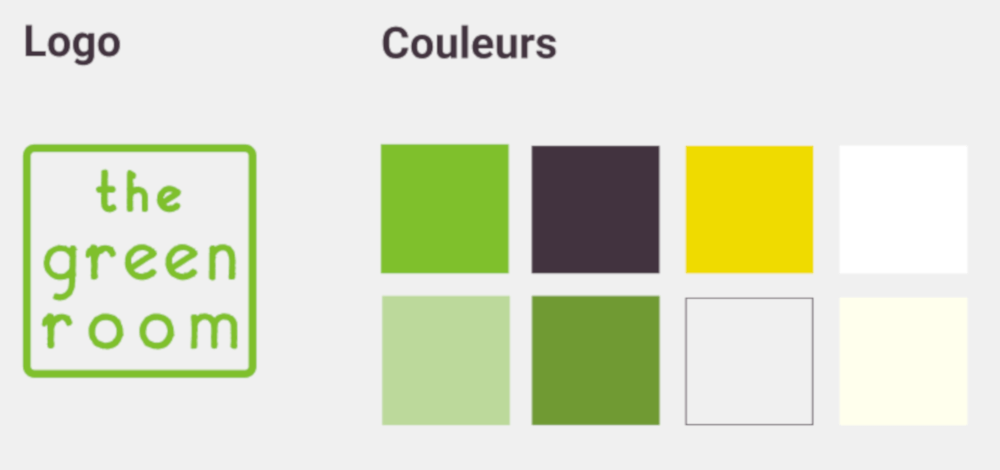
Simple navigation is provided by cutting out content and limiting subpages. The organisation's vivid colour palette was meant to evoke the entertainment world and maintain a positive spirit despite dealing with the ecological crisis. Simplified illustrations and shapes complete the content. The simplicity of the geometric shapes provides very light visuals (from 4 to 7 kb). They are coded directly, so they weigh very little.
Other key choices allowed us to limit the site's impact. We limited the number of illustrations and chose to limit images to projects referring to concrete actions. Images were compressed to reduce weight and we did not add specific fonts, we are only using those pre-installed by users. The design can therefore vary slightly from one OS to another but that allows us to avoid adding burden to the site.
To summarize the steps of our process:
- Project and requirement conceptualisation
- Similar sector website content analysis
- Sitemap design and content segmentation
- Wireframe and mood board creation (graphic design and illustrations)
- Online testing with a prototype
- Prototype update
- Illustration and prototype finalisation
- Writing a Kirby start-up guide
- SEO basics and website deployment
- Monitoring and maintenance
Results and follow-up
Our sustainable choices have another advantage: the ease of maintenance. This website is easier to install on the server and does not require a particular configuration. Security is improved with easier website backup and restore. Green hosting (Infomaniak) was also chosen. We strongly support this hosting provider due to its environmental and social policy; it is a partner in line with The Green Room's values.
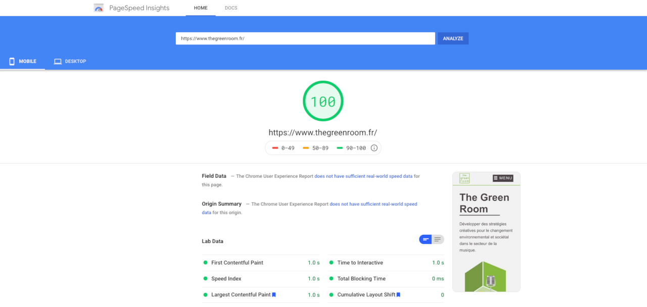
In 2020, the average web page weighed 2200 kb [source httpArchive]. We have designed a website that is 8 times lighter, with an average of 247.40 kb. If we exclude the page containing a YouTube video interview, we get an average page weight of 73.6 kb. Since we do not control this video, it was not possible to find an alternative to its integration, unfortunately. But the negative impact it has on our average page weight remains marginal.
Going through the most popular measurement tools confirmed the effect of sustainable web design. The Green Room's website achieved the best scores on all of them.
It should be noted that our choice not to install a web analytics service is not only respectful of user privacy but also saves energy by avoiding useless resources. Sustainable web design allowed us to create an easily accessible website and reduce development time and costs. It is also more easily indexed by search engines.
In the coming months, we will continue to test the site's usability and will maintain it and improve it thanks to user feedback.
We would like to thank The Green Room team for their trust and for making the bold choice to embrace sustainable web design. We are pleased with the result, as it shows the importance of research and design choices in low-impact web design.